Making the Orb
How the interactive orb in my site was made.
Introduction
Inspired by sites like Oimo I wanted to have one interactive element, ideally something that doesn’t get in the way and makes the main page standout while not being too resource intense.
I played with some other ideas like noise backgrounds, generating a map that constantly changes, Rorschach patterns, floating particles, but none of them looked good enough (I’m not a designer) or felt more special than a background.
Implementation
Then I saw this wonderful video from Barney Codes and I loved how the flow field looked; He did a wonderful explanation and re-creating it was a breeze, a channel totally worth subscribing.
Tweaks
p5 can be a bit of a heavy library and it’s global nature makes it not ideal for a final implementation, I ported the code to be mostly vanilla js with the exception of the perlin noise, the author of the library has a good article of how it works, “Creating perlin noise in JS”.
See the Pen Flow Field with chromatic aberration
One of the ideas I had in mind for the site theme was using chromatic aberration for some elements, adding it to the flow field really makes it pop just by displacing the particles in red, green and blue; At this point it looked good, but it had some problems, making it such a huge background element requires many particles, this can be an intensive task so if I could make it smaller.
Inspiration
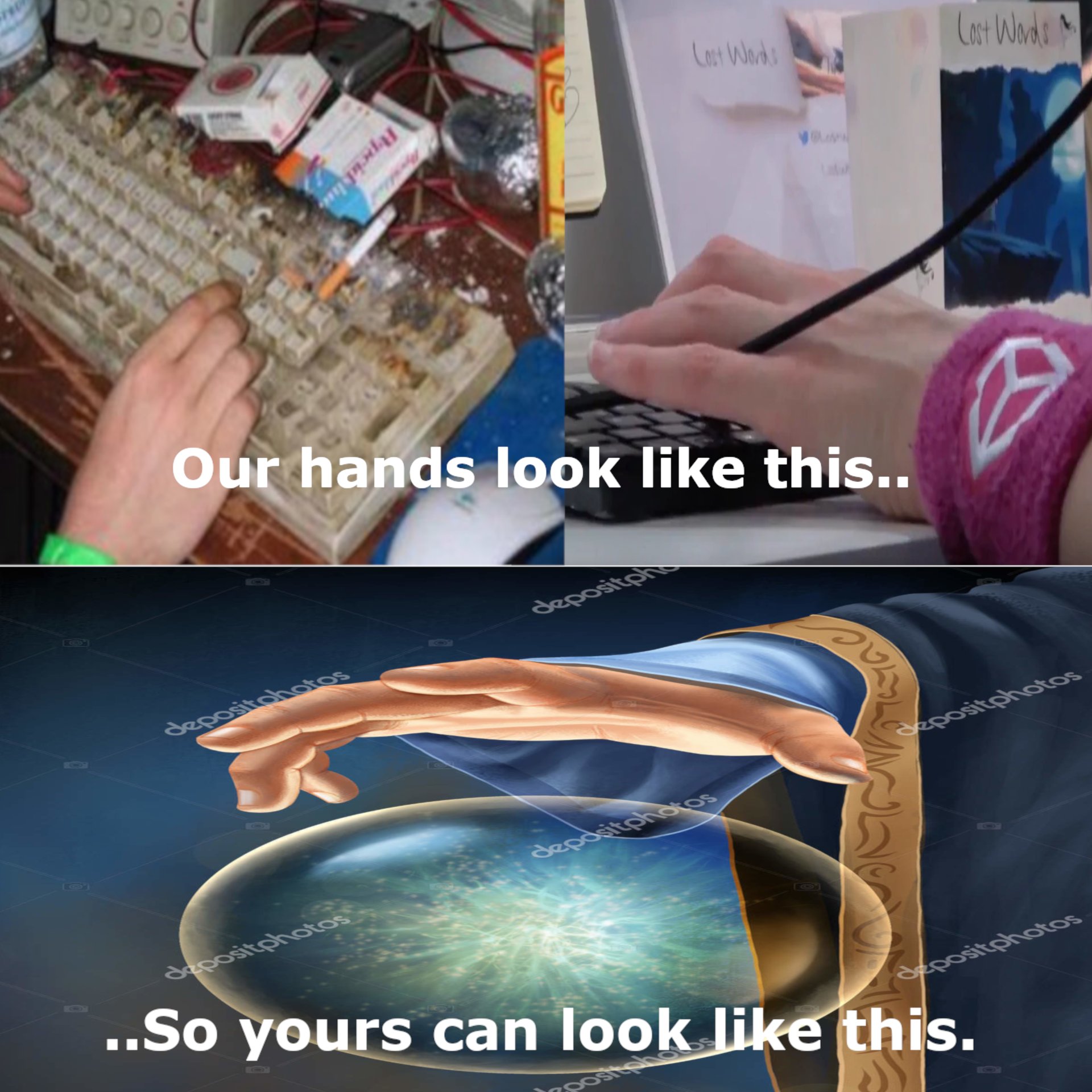
The idea of making it an orb was inspired by this meme and his wonderful game Wiz.Zone, I thought using the orb and including the flow field inside would look interesting, while reducing the number of particles needed, I’m definitely pleased with the result.

I also decided to use a photo of my hand and use a dither filter using https://doodad.dev/dither-me-this, personally it would look better with more contrast, but for an initial version it looks good enough, the hand it’s also divided in two different layers to make give the impression to be between the fingers.
Final touches
I added some other changes like turning the direction of the flow according to the mouse position, and some minor change that probably nobody will ever notice, to do the same using the device orientation on phones.
window.addEventListener(
  "deviceorientation",
  (event) => {
    leftToRight = event.gamma;
  },
  true
);
There are some other minor changes like stacked shadows to make it look more like glass and a shine in the background.
As an Easter egg, I also made it show some basic animation if JavaScript it’s disabled.